
UPDATE: As of April 2016, this site is no longer available to view online. However, the information and opinions shared in this review are still valid.
Mini Website Review for JoyAfterCancer.com
A few simple design changes was all it took from taking this okay website to one the client now loves. It’s not a full-of-feature site. It’s sleek and simple and fulfills the Number 1 Criteria for any website: It does the job it was designed to do per the owner’s intended purpose and goal.
Number 1 Criteria for any website:
— To do the job it was designed to do per the owner’s intended purpose and goal
Before we started, Peggy couldn’t put her finger on what seemed off, but she did feel that something wasn’t quite right.
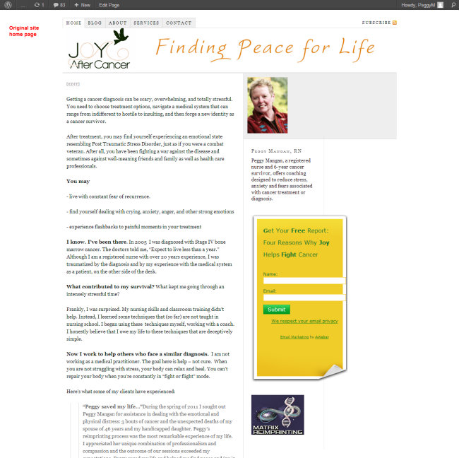
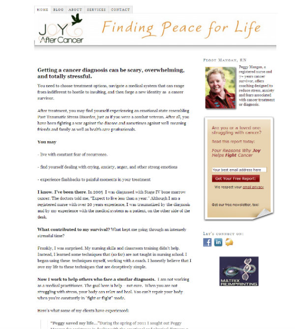
The first thing I noticed was the opt-in box. Its colors weren’t harmonious to the rest of the design, so we tweaked the colors. Then we concentrated on re-wording her freebie offer, as well as tweaking the layout and wording about Peggy herself in the top widget.
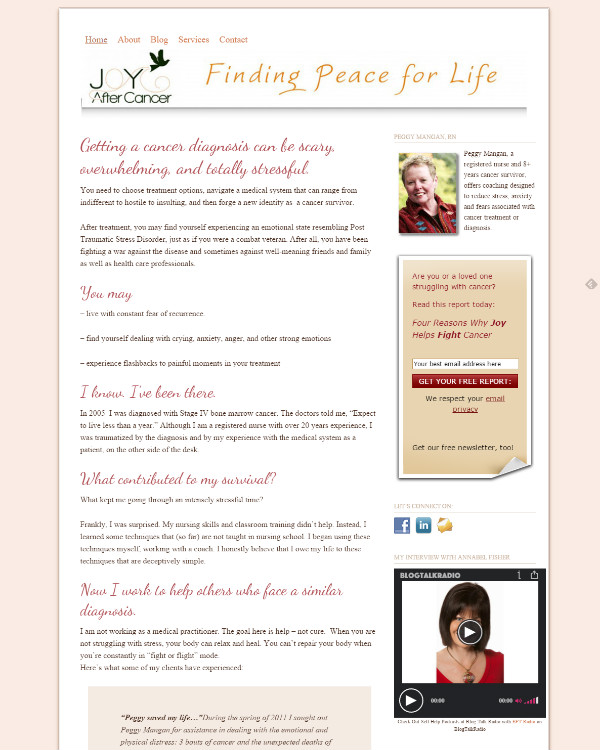
The second After screenshot shows a few more changes. Theme was changed from Thesis to Genesis with Prose child theme (although we could have accomplished the visual changes in Thesis). The headline and body fonts changed, and per Peggy’s request, we featured one of her Google Hangouts interviews in the sidebar just with simple coding to add a post link and image from her blog. A few additional changes were made to her Blog page, as well as the sidebars.
Before
After
After changing theme and adding some flare
What do you think of these changes? Better or Worse?
Share your feedback in the Comment section below. Feel free to include additional advice, suggestions, and questions.
We discussed this review on the February 5th Freebie Friday show I co-host on Blab with Stephen B. Henry. Here’s the replay:
Want some free professional advice about your website?
Click here to request a FREE Mini Website Review from Kat and Steve here:
Wow, this is more than I expected from the reviews. I thought you were just going to comment, not actually have folks make the changes so we could see the difference. Nice work.
I like the added “flare” a lot as it lightens the page from all one text piece. I agree that the color change softened the opt-in box from a blast-in-the-face to an I’m-here-please -enter-your-information box . It is much more inviting. Now, the Google Hangouts video jumps out as the first thing my eye sees rather than even your name or information. I am wondering if there is a way to change the black box around the video to match the opt-in box color or soften the stark black. When I get back over to the content, it is good and tells the appropriate information I would anticipate and want to read.
Yes, overall, more inviting.
Thanks for your detailed feedback, Cindy. Not all Mini Website Reviews will have Before / After images, but that’s definitely my preferred way to share them. And, of course, the focus here were quick and easy tweaks that make a real difference.
The whole site is much cleaner, colors matching, overall more appealing.
Great Job Kat!
Hi Sabrina! Thanks for taking time to check out this first review and share your feedback. Feel free to let others know who might like a free Mini Website Review.
Very interesting to see the changes. I think we all get too close to our own websites to see what changes are required. You have given me some ideas that I want to make on my other half’s business website – thank you!
Hi Paul. I sooooo agree with you about how we can get too close to our own websites. Glad my post triggered some ideas for you. Thanks for taking time to visit and comment.
It’s amazing how a few small changes can make such a big difference. I also made the switch from Thesis to Genesis and I’m really happy with Genesis now, although I suspect I only use a fraction of what it can do!
Hi Helen. Thanks for dropping by. I’m a HUGE fan of seeing what small tweaks can do. Nice knowing another Thesis to Genesis switcheroo. 🙂